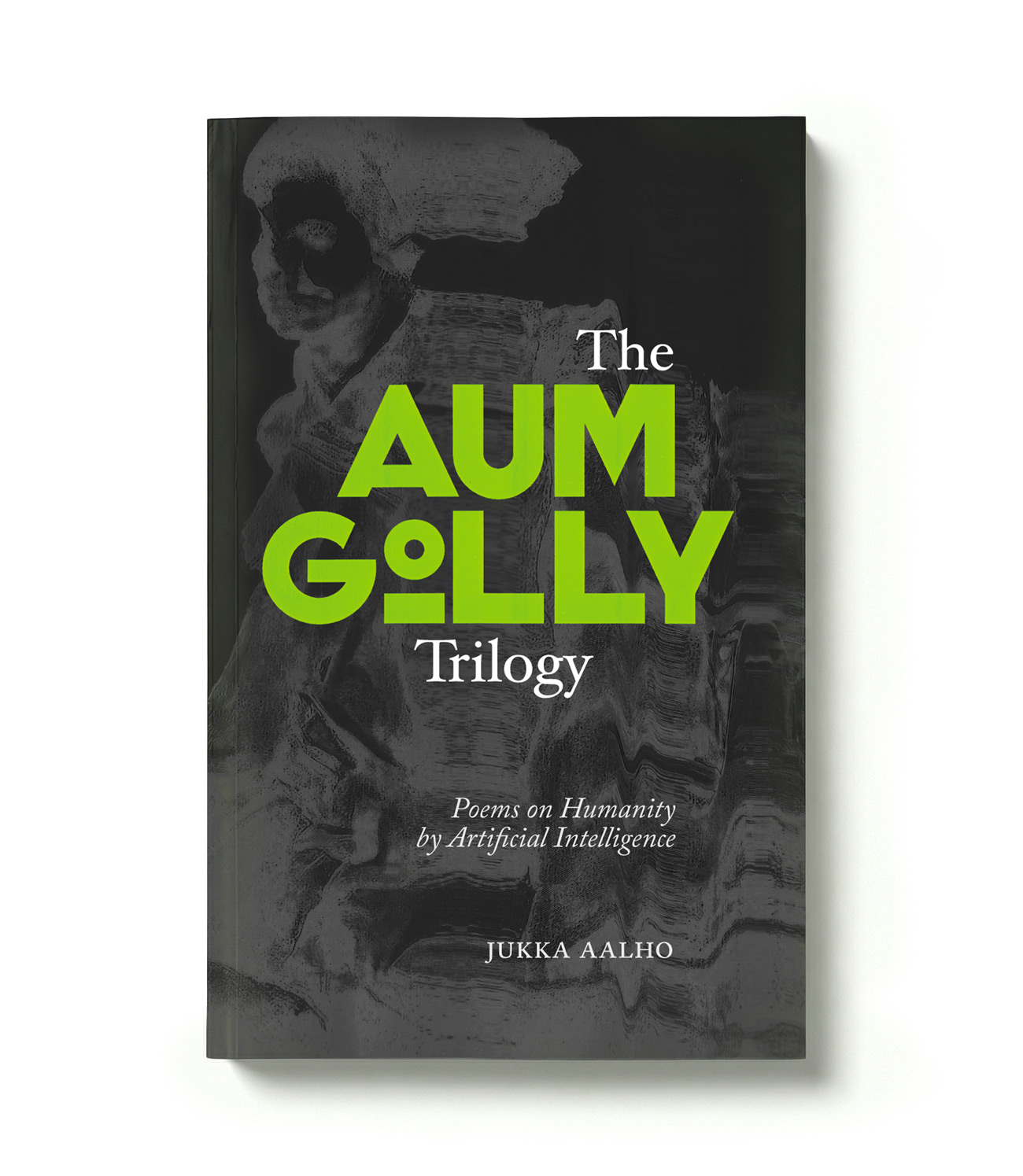
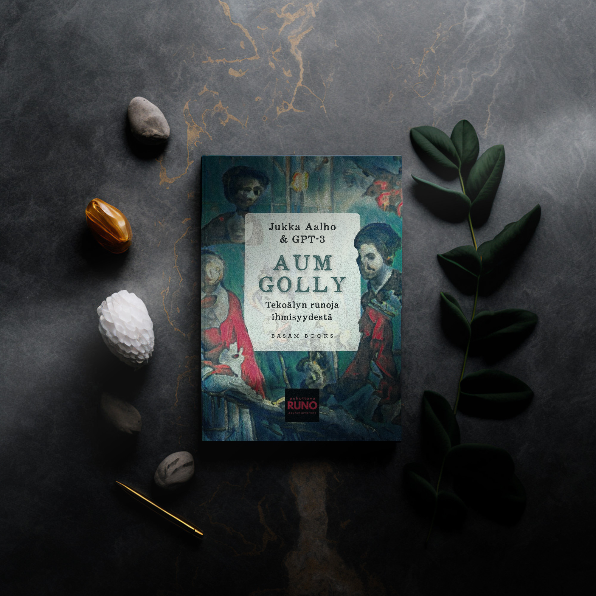
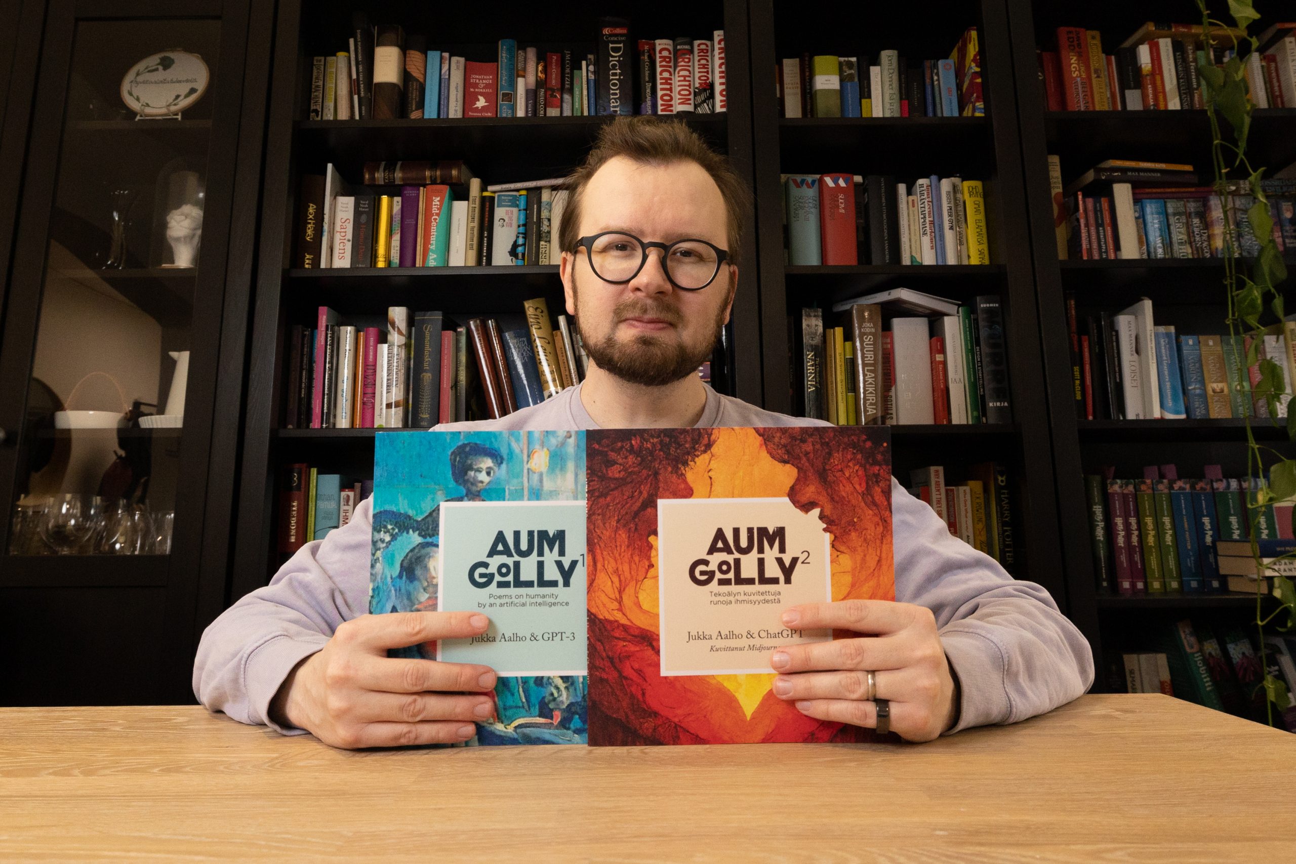
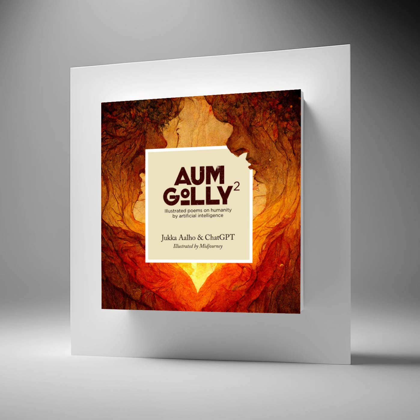
Like the Aum Golly poetry series itself, the Aum Golly logo is a collaboration between AI and humans. This is how the process went.
1. Idea for a logo style from AI
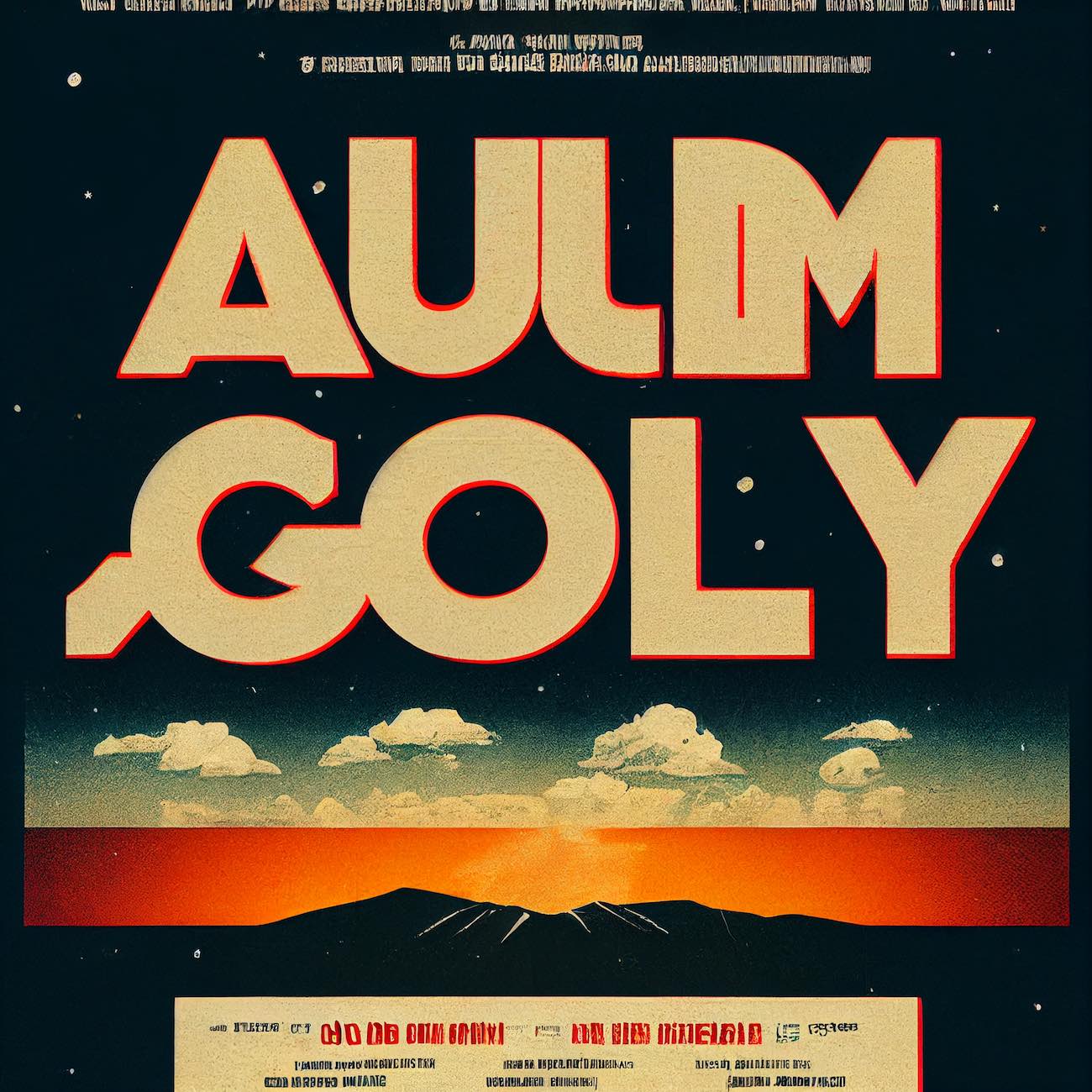
The first version of the logo was created by the image generator Midjourney. The prompt was “a movie poster with the words Aum Golly”.
This is what it spit out.

2. Logo exploration based on the AI image
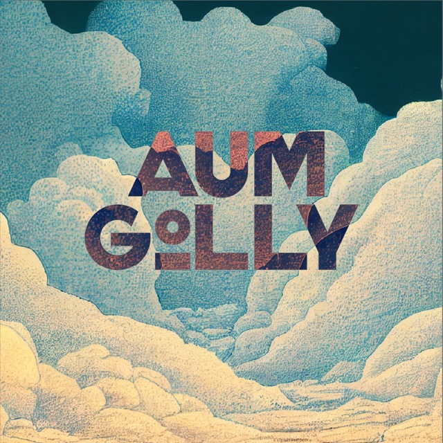
The picture had interesting elements and was well balanced. I first tried to draw the logo almost directly on top of the original image.
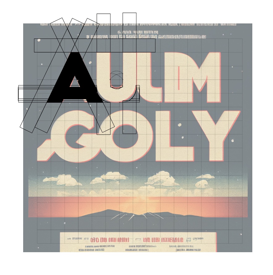
There were some interesting shapes in the M and G, but as a whole it didn’t seem to work.
3. Using the meat algorithm
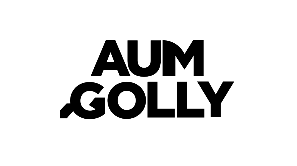
I wrestled with the logo for a while and decided I needed more help. Instead of AI, I sought help from a human. But because I was on a tight budget, I ended up with the low-cost service Fiverr. I ordered the logo and put up the versions I made.
Here is the best option I received.
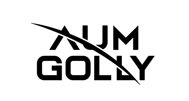
In principle, the logo was quite credible, and suitably technical but it was perhaps too sci-fi. With Aum Golly 2 in particular, I have wanted to move away from the images of the future towards softer values.
4. Back to the drawing board and finishing touches
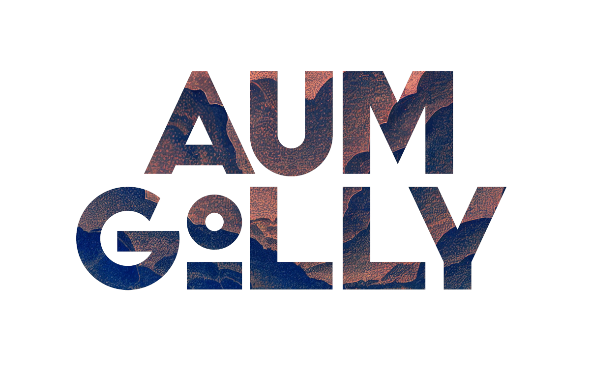
I liked the weight of the original logo. I drew the letters one by one with the same weight, using simple angles and widths.
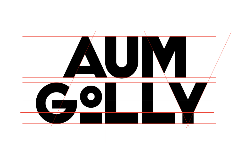
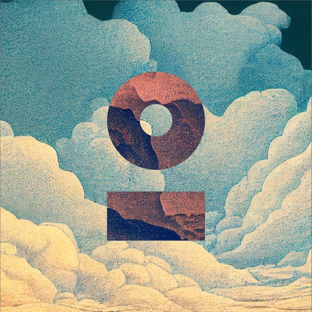
For the letter O, I wanted to reduce the dominant circle and create a detached element. The idea was also that, for example in logo animation, the character could be used in human form. The line is the shoulders and the circle is the head.
Metaphorically speaking, man has been relegated to a minor role compared to other elements.
5. Last touches and examples
To add the texture, I used both a background image and a light grunge effect.
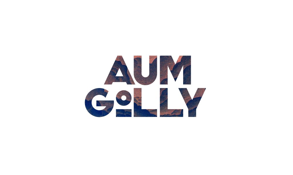
The elements can be used together and separately.
